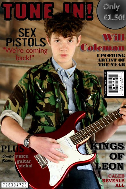
I have put the model over the top of the magazine logo, making him seem the most important thing on the page. This is a common convention of magazines. I also used a customised barcode (this is a found image) as it reinforces the theme of music by being a tape. Similarly to my school magazine I used a puff in the upper right hand corner with the price in.

Here I have reduced the brightness of the model and increased the contrast to bring out the pattern of his camo jacket and the deep red of the guitar. I did this by making the model a seperate layer to the background of the image so the background would not darken & have an increased contrast. This makes him stand out more. I also included a code in the bottom left hand corner which is similar to Kerrang! Magazine as it is a code to download the magazine onto an iPad/iPod. This keeps the magazine up with current technology and appeals to the younger generation, who is my target audience. In addition, I put in a feature of a free guitar picks which are limited edition to entice the audience into buying my magazine.

On this copy I included a banner at the bottom which is a common convention on music magazines and nearly all have a banner somewhere on the cover. I have also included a description of the main article about 'Will Coleman' to give the reader an idea of what the article will be about, this makes them want to read it and know more. I put the free guitar picks coverline in a banner under the model's head as it uses up white space and looks more professional than a coverline (also makes it stand out).
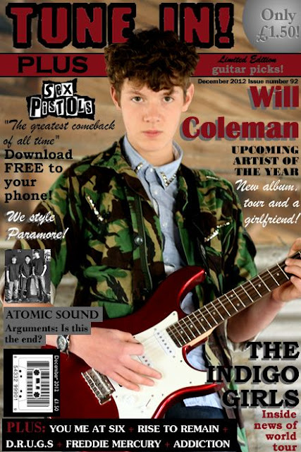
In this image I further edited the model by airbrushing his face to remove any blemishes. I also included a coverline about Atomic Sound. I made the article about the band splitting up as it is gossip that many people would want to get involved in and can talk about with friends- therefore the magazine is becoming a social event.
I included a description of the code that allows the reader to download to their phone- however I took the code off the cover in the next draft due to them being seperated by the barcode. I would also include the code in the contents page so there is no point in the code even being on the cover. I also altered the logo I used for the Sex Pistols (found image) as it was pixelated and blurry. This logo is much better and is one we all know. I also added colour to the bottom banner to make it look more professional.

This is my final draft. To make the magazine appeal to females I edited the 'Kings of Leon' sell line to 'The Indigo Girls'- a classic girl band. This band would appeal to my female target audience as it is relatable to them. I also included a coverline 'We Style Paramore!' which both adds an exclamative to the cover to add a variation of linguistic techniques and it adds the feminine element to the cover- fashion and styling. Finally, I slightly altered the puff in the upper right hand corner as it was too prominent and was more noticeable and bigger than the model's face. I made it lighter, no outline and behind the banner.


